
Any chart, no matter how well designed, will mislead us if we don’t pay attention to it. — Alberto Cairo
I’ve been fooled by charts, some made by others, some made by me. Because charts tend to be associated with science and reason. Once data is represented in a visual format, it “attains a kind of literal concrete quality that makes one think it is accurate”.
Chart designed poorly can easily mislead without detection, even when the designer doesn’t have ill-intent. If you don’t want to be misled by charts, you should first know how to read a chart. When you are equipped with that, look out for what I have laid out below.
When interviewing analytics/visualization candidates, these can also help you quickly differentiate the experienced from the novice.
So many things can go wrong with scales
The same data with different scales can deliver completely different messages. A chart that doesn’t mislead should have a sensible scale. Sensible in the sense that it delivers the right message for that context.
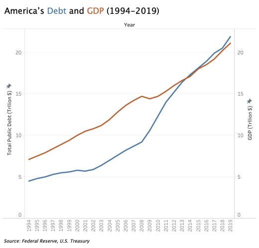
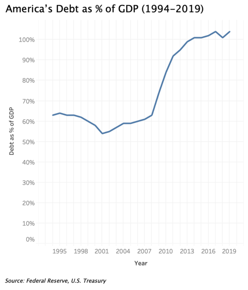
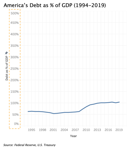
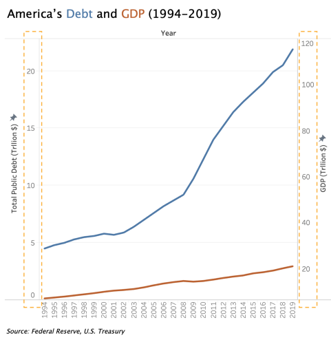
When communicating America’s debt as % of GDP from 1994 to 2019, the increase in % is so significant in this context that we should not downplay it with the scale on the right; unless you think people shouldn’t worry unless debt grows to be 500% of GDP?
When using double vertical scales in a visualization, manipulating the scales to be different will distort the representation of relationships between the two variables. The chart on the right below shows America’s debt has been continuously increasing from 1994–2019, and quite significantly over the years, while America’s GDP increased modestly. But in fact, both have increased at around the same rate until around 2008 when debt started to increase faster than GDP.

This happens more often than you think
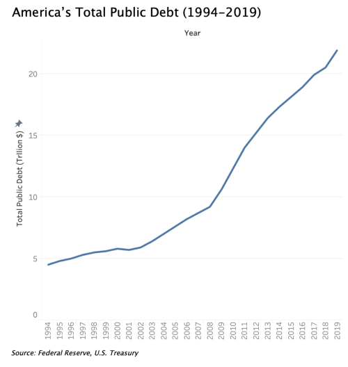
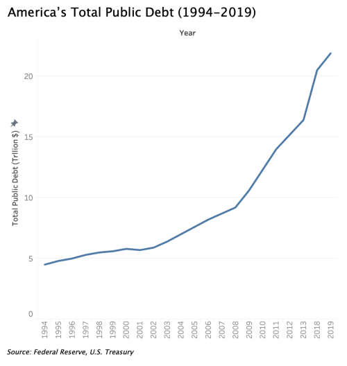
Look at the two charts below. Can you tell which one is not right? It’s hard to tell right? Believe it or not, it’s one of my most-made mistakes at work when preparing visuals for monthly analytics presentations.
Look closely at the x-axis of the right chart. Do you see it now?
4 years of data are missing!
Missing data is one of the most deceiving ways a chart can fool you because one, you just wouldn’t think it could happen; two, it needs laser focus to detect.
Another recent example of cherry-picking data to support a statement.
👆 President Trump telegraphed cherry-picked hours of DJIA as a piece of propaganda. I laid his ✍️signed chart (red outline) atop the current 10 day DJIA. https://t.co/SHSUDSHulU
— RJ Andrews (@infowetrust) March 16, 2020
A good example of @AlbertoCairo's HOW CHARTS LIE ch 4: pic.twitter.com/GzCLORw1z5
Conceal uncertainty
Even though I wrote a whole blog post about communicating uncertainty in visualization, I still caught myself making this mistake — not properly representing uncertainty in my visualization.
If you look at the source of the chart below, you would notice the data after March 2018 were in fact predicted vs. the actual data. To not mislead people to draw wrong conclusions and make wrong decisions, I should’ve indicated that in the lines with blur or shading, and other tools mentioned in the post.
Misleading patterns
In how to read a chart, I wrote that reading annotation and spotting patterns should be the last two steps of reading a chart. The caveat of that, as with any visualization interpretation, is to not take what’s shown on the chart as hard facts, because that’s how you can get fooled.
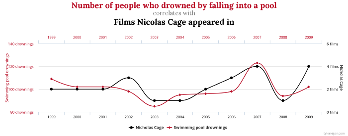
The most classic example of showing misleading patterns is spurious correlation. Are the number of people who drowned by falling into a pool and films Nicolas Cage appeared in really correlated?
Fake data?
Last but certainly not least, because it’s something I rarely pay attention to until reading about it in Cairo’s book, check the data reliability. Does the data come from trustworthy sources, are the metrics calculated correctly, or they are just stats politicians/marketers/advertisers throw at you to serve their purpose?
Mentioned in this post: