

Only by admitting the limits of our certainty can we make advances in better prediction. — Nate Silver, The Signal and the Noise
The ultimate goal of data visualizations is to support decision-making, in one form or another. And the often-neglected peril of data visualizations is that once data is represented in a visual format, it “attains a kind of literal concrete quality that makes one think it is accurate” (Colin Ware, Information Visualization). The 2016 election is a perfect example of how deemphasizing the uncertainty (margin of error) can lead people to wrong conclusions and make wrong decisions.
Based on research, uncertainty visualization overall has a positive effect on decision accuracy. Although it has also been shown to cause delays in decision-making when extra information needs to be processed and the risk of focusing on worst-case scenarios. In some cases, training is needed in order for decision-makers to know how to interpret data with related uncertainty.
Visualization designers can support by providing graphic literacy and effective decision support tools to ensure decision-makers can use uncertainty information properly.
I will touch on some of the tips and tools below based on learnings from the catalog that inspired this post: Visualising Uncertainty: A Short Introduction by Jo L. Walton and Polina Levontin.
Framework for uncertainty visualization
Unfortunately, there is no one-size-fits-all optimal framework for uncertainty visualization, because “how we visualize uncertainty is not easily separable from how we interpret and reason about that uncertainty” (Visualising Uncertainty).
Every uncertainty visualization (any visualizations actually) requires a deep understanding of the data at hand, what decisions are going to be made from the visualization, and stakeholders’ variations in preferences and capabilities.
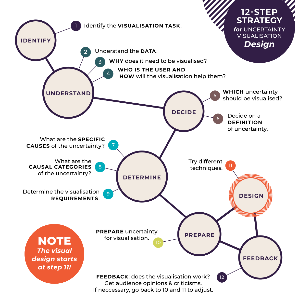
In Visualising Uncertainty, a 12-step strategy is presented for uncertainty visualization design. Two things to highlight (i) the actual design starts at step 11 (ii) not all uncertainty should be and/or can be visualized.
- Identify the visualization task
- Understand the data
- Why does it need to be visualized?
- Who is the user and how will the visualization help them?
- Which uncertainty should be visualized? How should we prioritize if multiple uncertainties present?
- Decide on a definition of uncertainty.
- What are the specific causes of the uncertainty?
- What are the causal categories of the uncertainty? Can we establish causality with confidence?
- Determine the visualization requirements. What information need to be presented to help the user with the tasks?
- Prepare uncertainty visualization
- Design
- Collect feedback from stakeholders and go back to 10 and 11 to adjust.
Types of Uncertainty
Nailing down on the nature of uncertainty at hand, if it’s identifiable, quantifiable, and helpful, is an important step to determine if and what visualization tool should be used.
Below is one type of categorization of uncertainty:
- Accuracy: the difference between observation and reality
- Precision: the quality of the estimate or measurement
- Completeness: the extent to which information elements agree
- Lineage: the pathway through which information has been passed
- Currency: the time span from occurrence to information presentation
- Credibility: the reliability of the information source
- Subjectivity: the extent to which the observer influences the observation
- Interrelatedness: the dependence on other information
- Experimental: the width of a random distribution of observations
- Geometric: the region within which a spatial observation lies
Visualization Tools for Uncertainty
If you were to reach the decision to use visualization to represent uncertainty, depending on the type of uncertainty, there are a couple of different visualization tools you can use.
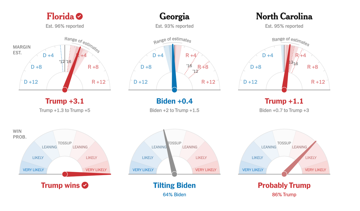
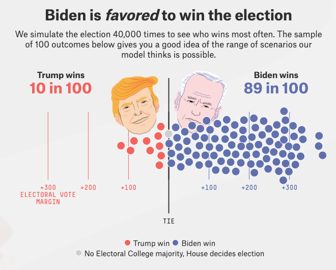
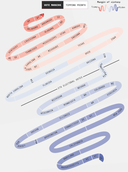
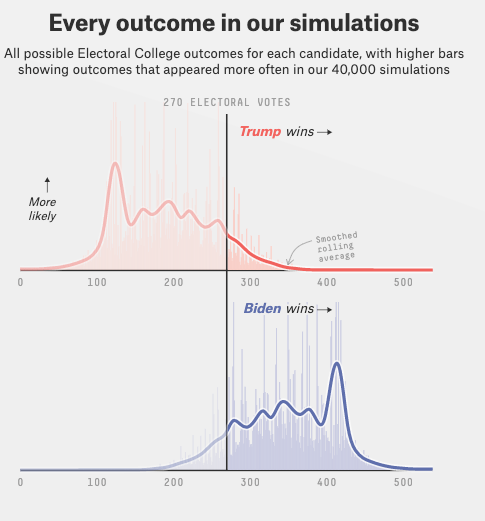
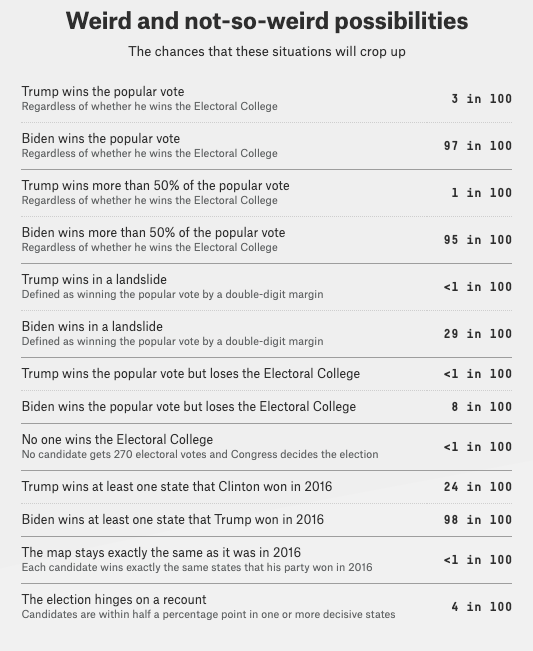
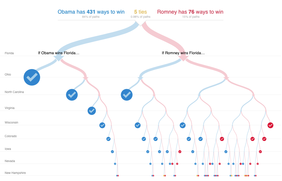
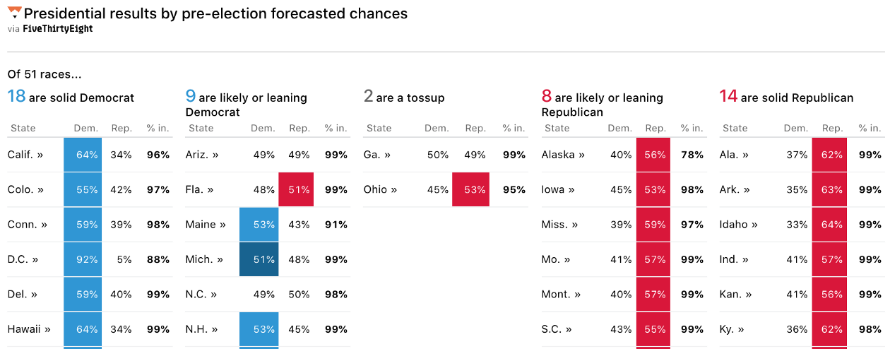
The examples below are pulled from US presidential election results visualizations — accuracy and precision are the biggest uncertainty that need to be addressed in such context.
Simulations
- Showing simulations are helpful when you need to present a range of possibilities, both the upside and downside.
- Pros: give a sense of build-up and possibilities
- Cons: data overload can lead to interpretation difficulty
Obscurity/Blurriness
- Fogginess is a powerful visual metaphor for showing uncertainty.
- Pros: Intuitive metaphor
- Cons: Maybe subject to different interpretation; hard to show levels of uncertainty
Error Bars/Lines
- Bars and lines can indicate the uncertainty in a quantifiable measure
- Pros: Useful to compare multiple estimates; easily understood
- Cons: Details in the data can get lost (difference in possibilities of errors) if not represented properly (e.g. gradient plots can provide point estimates with probability density function shown as a gradient, which provides more information than simple error bars).

Distributions
- Show the spread of possible values.
- Pros: user can make a more educated judgment about the sample vs. just looking at means/median.
- Cons: many people don’t understand distributions so additional explanations are needed
Multiple Outcomes
- Especially helpful to see various outcomes for projections and forecasts
- Pros: Uncertainty is displayed more explicitly
- Cons: Too many possibilities can lead to confusion
Decision Trees
- Useful to understand how different interconnected decisions lead to different outcomes
- Pros: Flexibility in navigation
- Cons: Information overload
Words
Sometimes words are the most straightforward way to communicate uncertainty.
More and more complex decision-making will involve information visualization. Although there is no ‘optimal’ way to communicate uncertainty, I hope this post at least brings awareness to the importance of uncertainty communication in visualization, as well as equips you with some tools for visualizing uncertainty.
Mentioned in this post: