
Have you ever had people looked at your chart for 5 seconds, threw their hands in the air, and said it’s confusing? Have you ever misunderstood a chart because you weren’t looking closely —like the classic it’s going up right it must be good? Both have happened and are still happening to me, understandably so.
We are surrounded by charts every day demanding our proper interpretation, but we weren’t taught how to do it. We tend to naturally mistaken charts for drawings, expecting to grasp all the information at one glance. But a chart that is properly made is so rich in information that it requires work to properly read and understand them.
Before you create a chart, you need to know how people read them. Before you interpret a chart, you need to know how to read them. So whether you are a designer or a reader, here’s how to read a chart.
*This post is partly based on learnings from Alberto Cairo’s wonderful book, How Charts Lie. I highly recommend you read it yourself.

1. Start with a chart’s title, description, and source
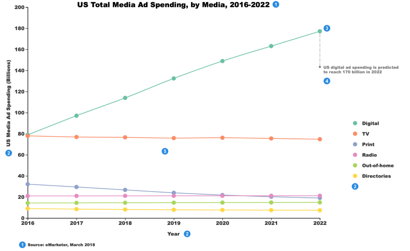
Looking at a chart’s title and description will give you a quick overall understanding of what the chart is about before moving on to the details. In this chart, we are looking at US Total Media Ad Spending by each media channel from 2016 to 2022. The source then will tell you where the data comes from — if it’s trustworthy enough for you to keep reading, and when the data is collected — if the data is outdated. So seeing the data was collected in March 2018, we know the data points after that were predicted.
2. Read scales and legends next
Scales (axis+label) and legends are what I have seen many skip when reading or designing charts. They are extremely important to show what is measured and how it is measured. In this chart, the x-axis is year, the y-axis is US Media Ad Spending, measured in billions. The legend shows the color representation of each media.
3. Understand the visual encoding
Visual encoding tells how the information is visualized. In this chart, colors indicate different media; each point’s position represents the year and the spending of each media; the line shows the trend over the years. In bar charts, the method of visual encoding is height.
4. Read annotations, if any
Annotations are useful for designers to highlight the most important takeaways from a chart. I used to make the mistake of thinking anybody would get the same point as me from a chart. However, from experience, a chart that speaks one thing to a person rarely speaks the same to another, so it’s important to emphasize the key insight you want to communicate through the chart. Annotations also help greatly when facing an impatient chart reader.
5. Zoom out and spot other patterns and relationships
Finally, after you understand the key elements of the chart, you are equipped to spot other patterns and relationships that are interesting to you. For example, from this chart, you might want to know the media channels that are predicted to decline in the upcoming years, and that is print, the purple line.
Visual interpretations can be subjective. Not every chart is intuitive for everyone to read correctly without proper training. I hope this post* offers some valuable insights on how to read a chart. After all, we cannot communicate through data visualization if we don’t “speak” the same visual language.
Mentioned in this post: