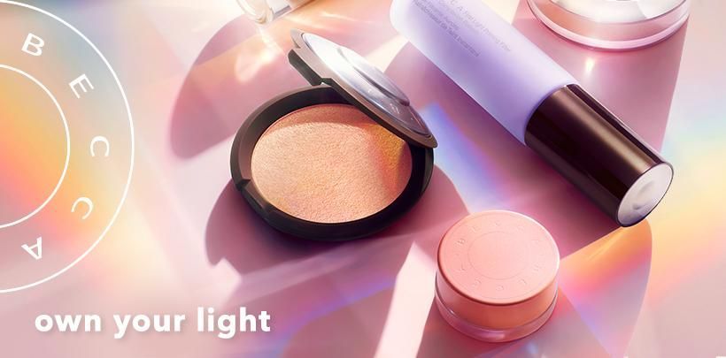

If you don’t know yet, I have another side hustle building a beauty dupes community. I was researching for a post on dupes for Becca Cosmetics, a well-known beauty brand that is closing down soon, and their ecommerce site surprised me with some of the best ecommerce UX designs.
Content meets commerce is not a new concept, but few ecommerce sites integrate the two well enough to create a smooth, uninterrupted experience. Often content and commerce are siloed with at least a few clicks or scrolls in between, Becca however, created a coherent shopping experience through seemingly simple yet thoughtful UX designs that almost mimic a retail shopping experience.
Don’t do what you won’t do in retail in ecommerce.
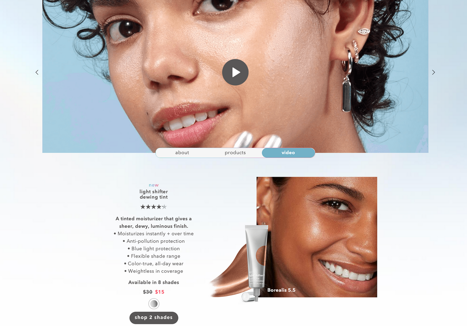
One Pager Storytelling + Shopping
For each product launch, Becca creates a single page story where customers can learn about the why, what, and how of launch, while can also shop the products without having to leave the page.
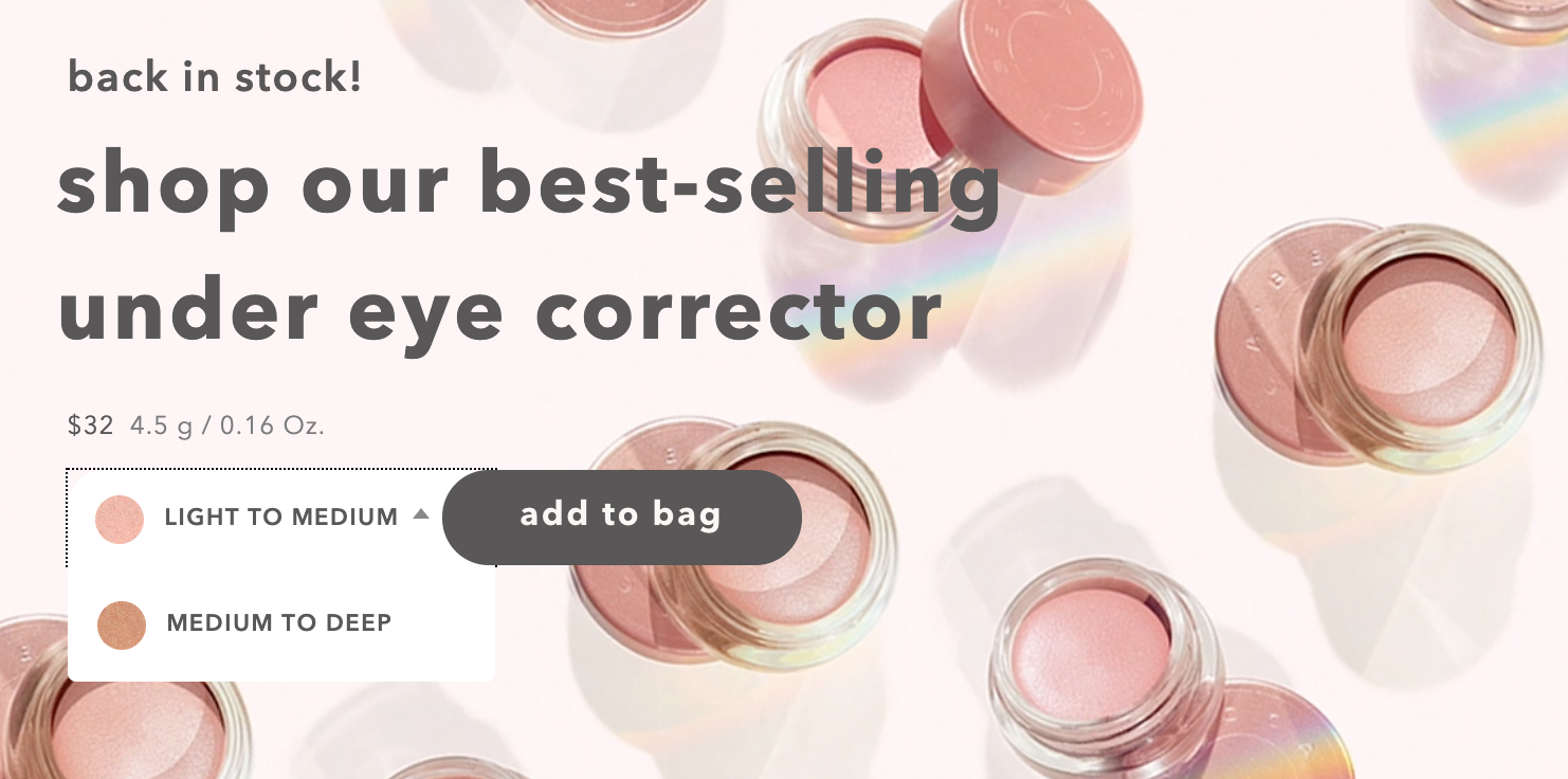
Shop Popular Products with One Click
For popular products that customers know well and repurchase frequently, Becca lets customers add products to the cart directly from the back-in-stock banner.
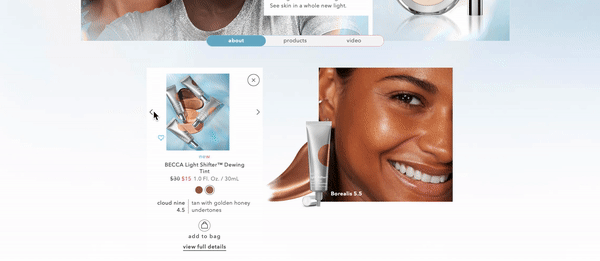
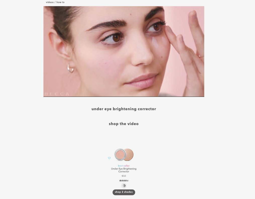
Shop the Tutorial
The site allows customers to add products to cart directly on the page where they watch the tutorial with the products in.
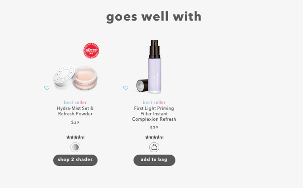
It’s Like Shopping with a Sales Rep
Becca put products that pair well with the one customer is looking at to guide the customer’s shopping experience. A simple design that helps the customer put together a routine without going through a complicated quiz. It would be even more compelling if they explain the why behind the recommendations.
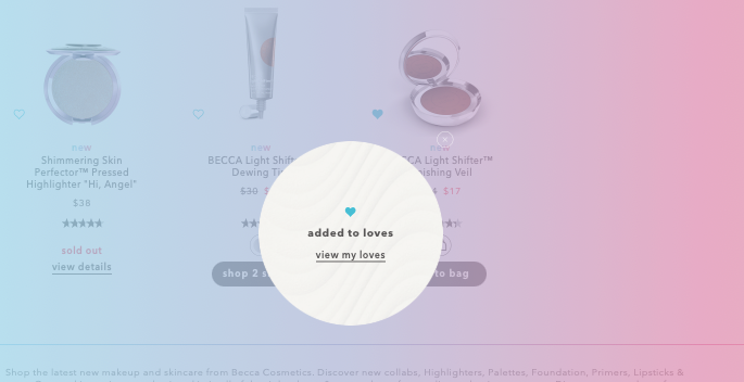
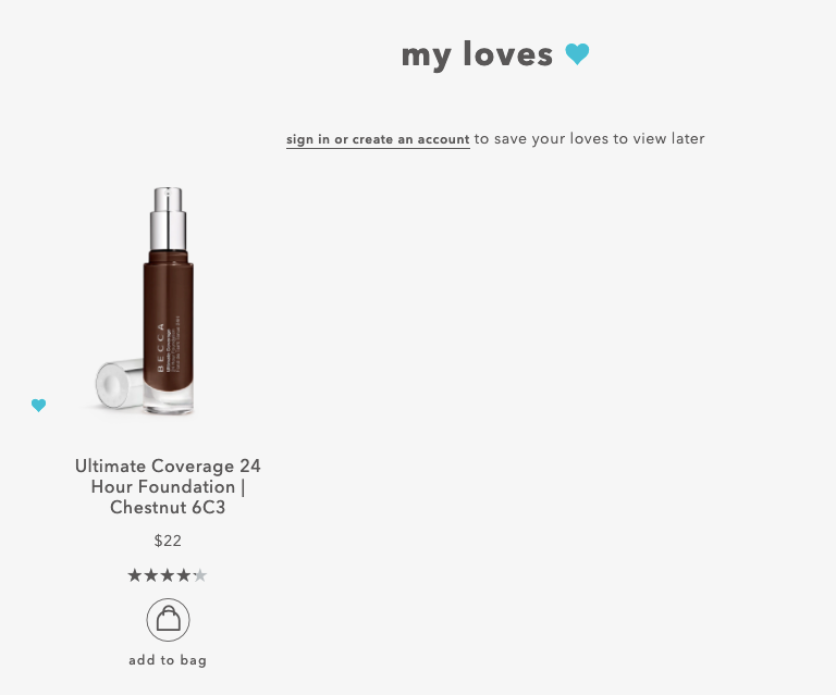
Easily Add Products to Loves
This is a genius win-win tactic for the brand and customer. Most customers are not ready to buy during their first session but maybe are intrigued by a few products. By giving them an easy option to add products to loves, the brand saves customers time, collects their emails, and greatly increases the probability of them returning to the site.
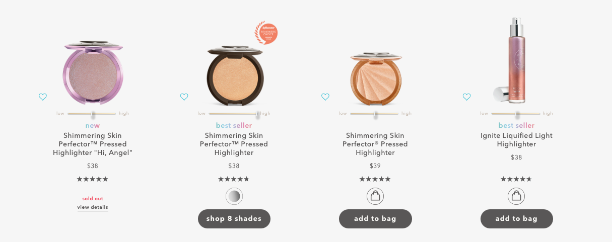
Product Comparison in One View
The essence of Becca’s UX design is to give customers all the information they need where they need them without having to go back and forth between pages.
For their signature product category (highlighter) with multiple variations, the brand gives each product a highlighter scale in the category overview page to help customers filter down options right then and there. With key info provided, customers can also directly add products to cart on the overview page without extra clicks.
P.S. The BIG caveat of this post is Becca’s site speed is unacceptably slow (22/100 google speed score). Site speed is one of if not the most important conversion influencing factors for an ecommerce site. No ‘fancy’ UX design should come at the cost of the site speed, otherwise, people will bounce faster than you can say conversions.