

This is a quick summary of my recent deeper dive into the subject of landing pages.
Definition
- A landing page is a page where users "land on", an entrance page.
- It's the first page users see after clicking an ad source.
- Different from other pages, it should work independently on-site and focus on a clear conversion goal for the users that land on it, ideally customized for each type of traffic (more on this below).
Characteristics of a good landing page
- shortens the journey from click to conversion goal (engagement, lead, purchase, etc. whatever it is, be sure to define it.)
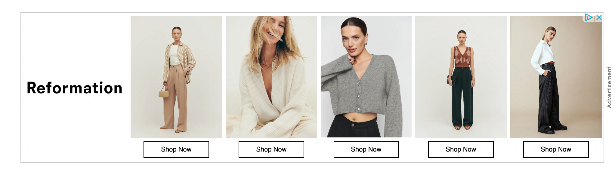
Example 1: Each shop now button leads users to the respective PDP page without users having to find the item again.
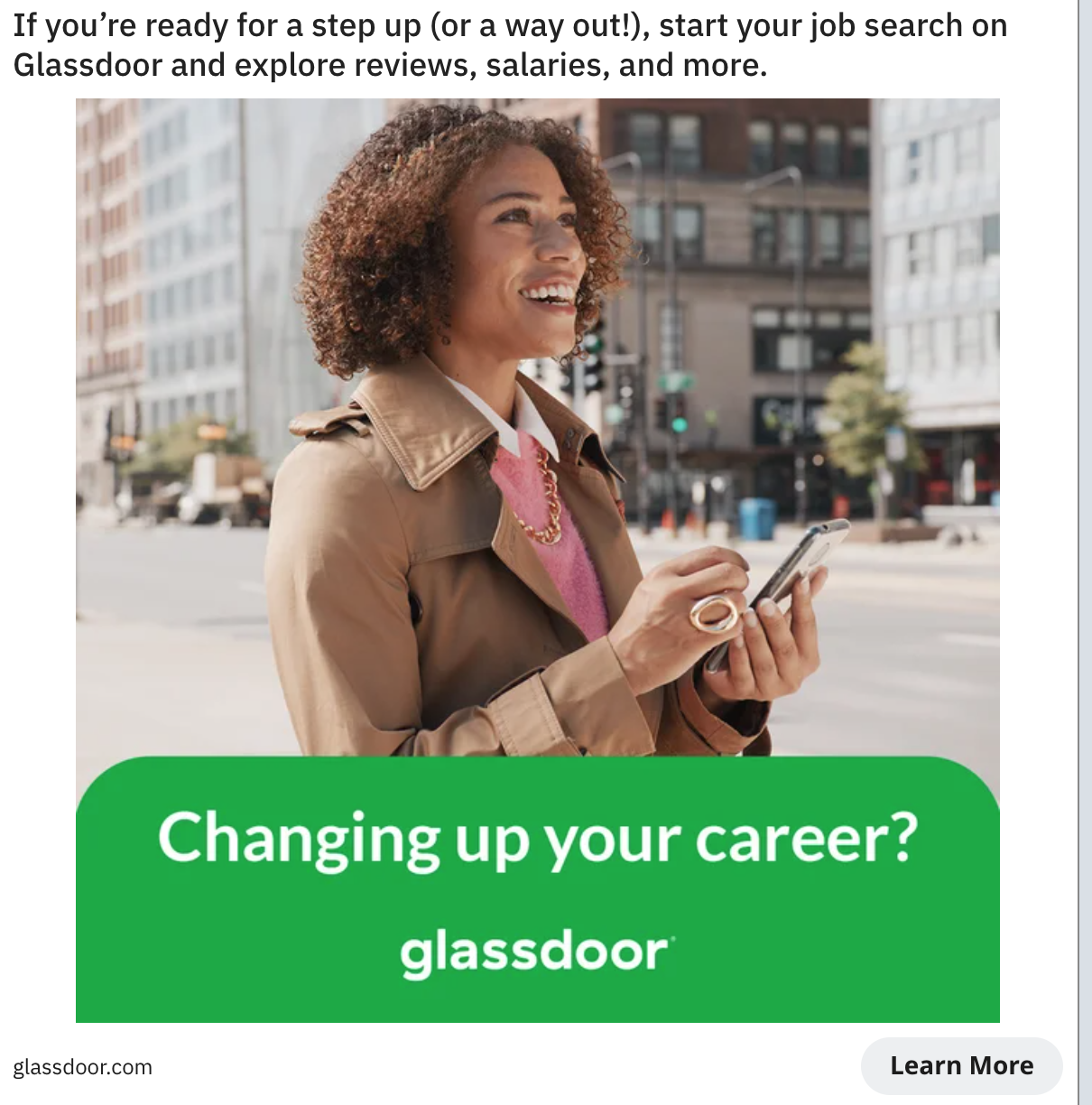
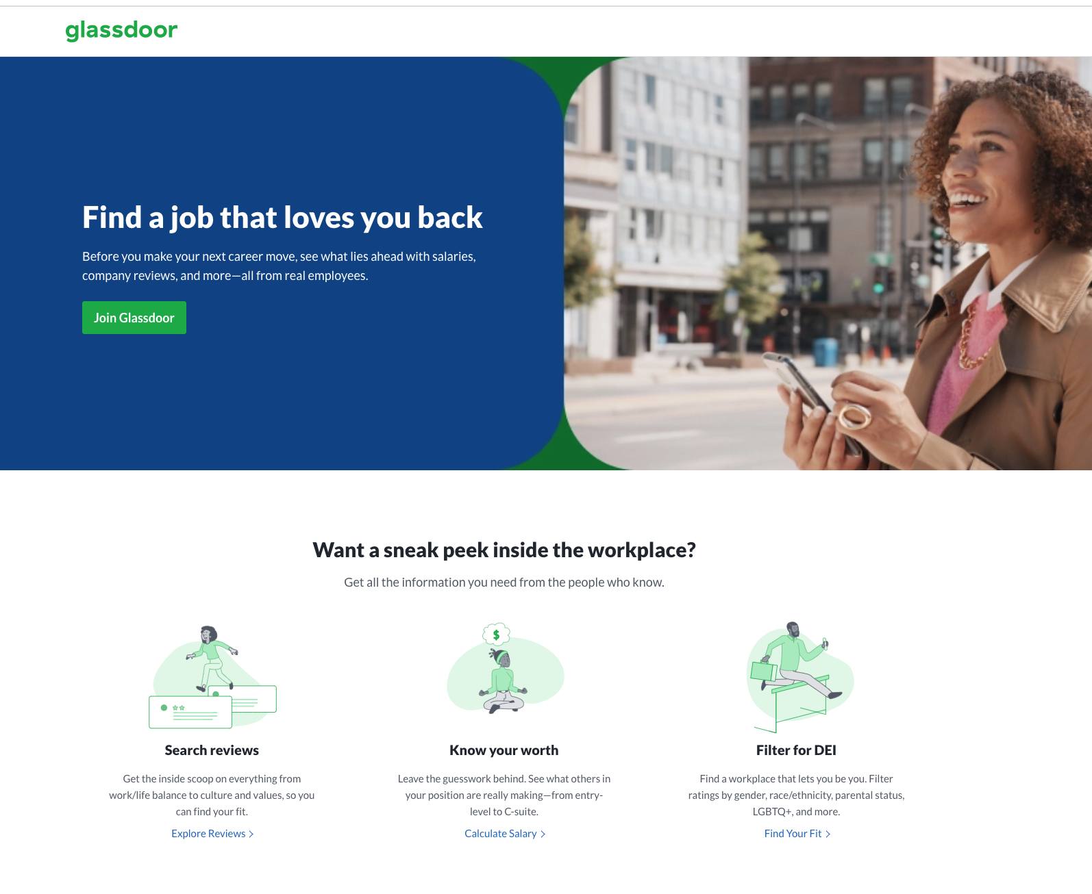
Example 2: The Ad targets job seekers, the conversion goal is to get people to sign up for an account on Glassdoor, and the landing page puts all the benefits Glassdoor offers to job seekers on one page (reviews, salary, company fit info) as hooks to get users to sign up.
2. follows up on "promises" made in ad sources
Priming bias means exposure to one stimulus alters responses to the other stimulus, users would subconsciously place more importance on the ad content they just saw when they land on the page. If your ad content doesn't match the LP content, it would trigger cognitive dissonance, cause discomfort in users, and lead them to bounce off your page.
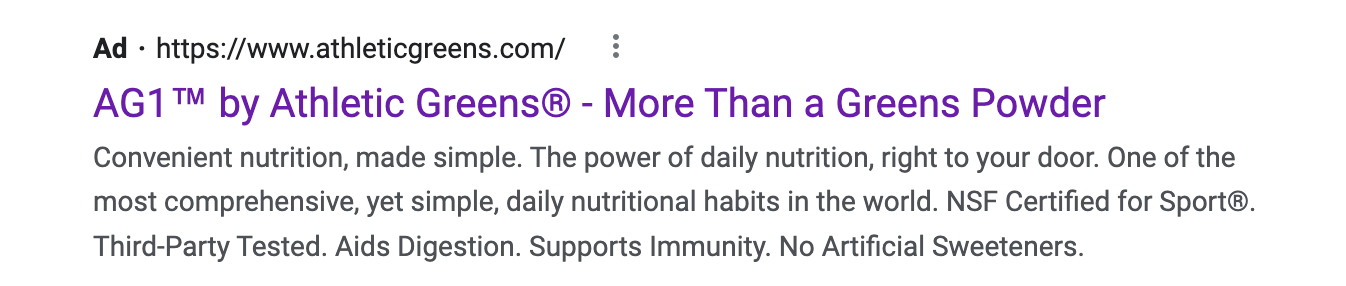
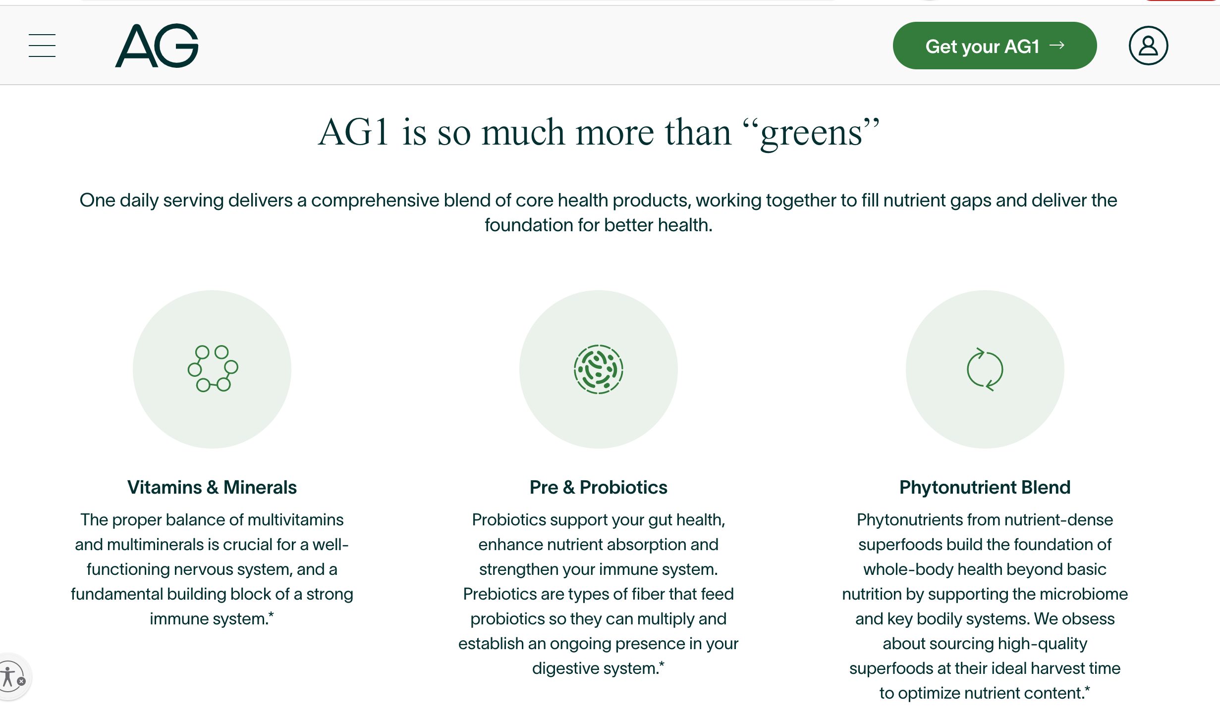
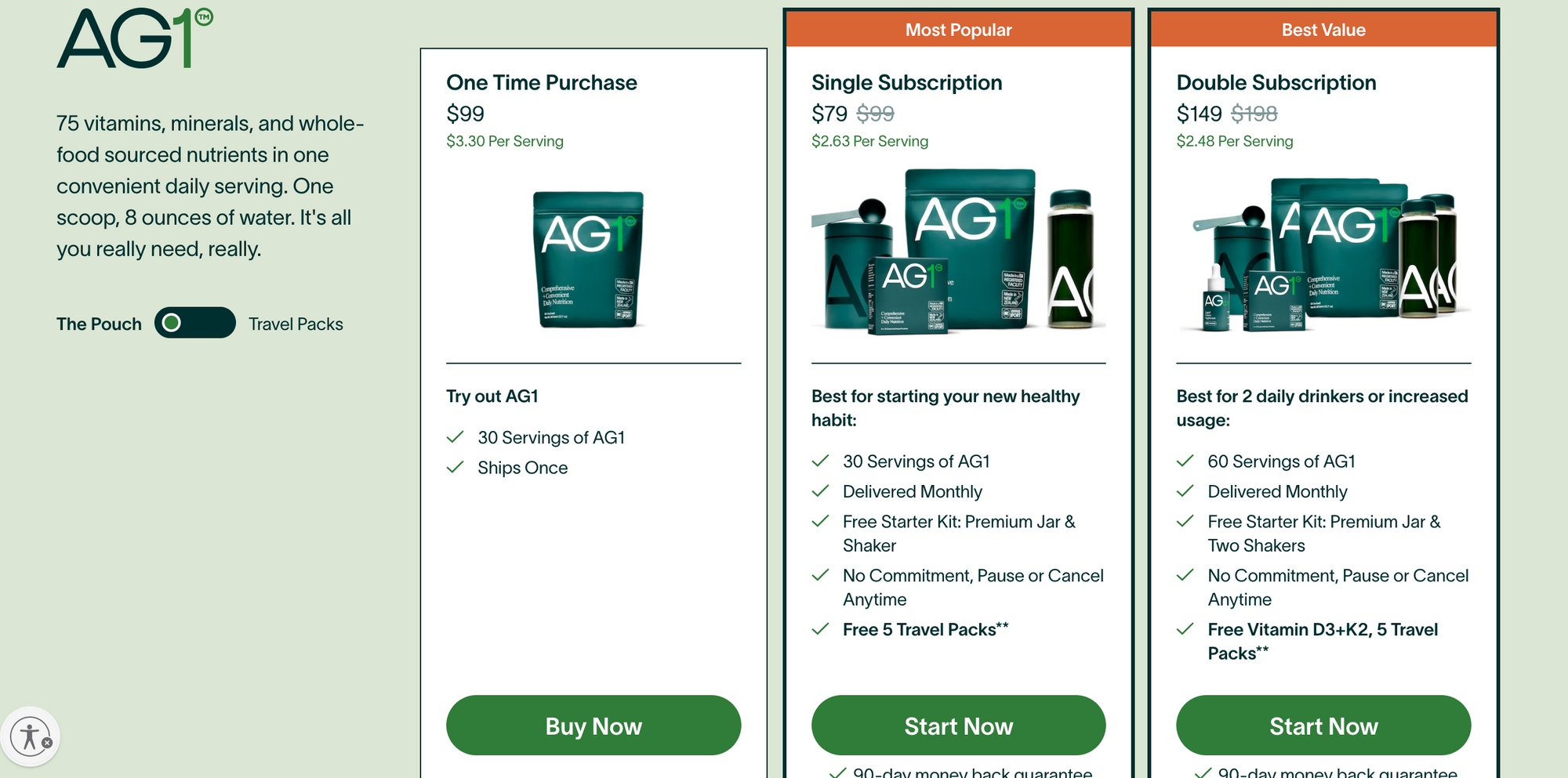
Example 1: AG's landing page follows up on why it's more than a green powder (the hook in the ad) on the LP in more detail.
3. speaks to user motivation & addresses barriers
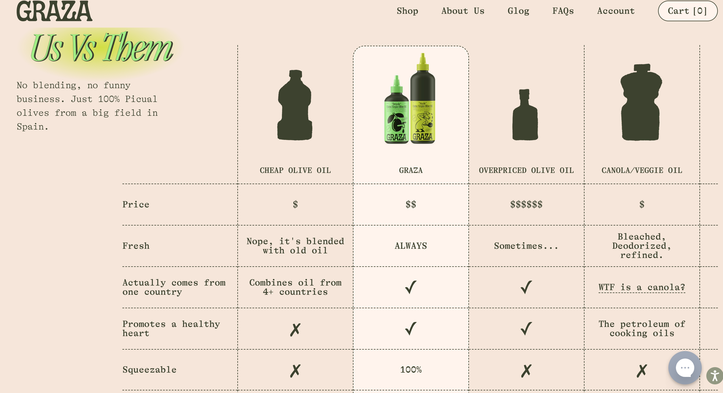
Example: Why would I spend $20 on a bottle of olive oil from a new brand instead of getting one from Costco? Graza answers this common barrier of purchase with the 'Us vs. Them' chart, touching on the customer purchase motivation: health benefits, convenience, premium quality fresh tasty oil - building momentum & removing objections.
4. answers important questions & creates clarity (effortless experience)
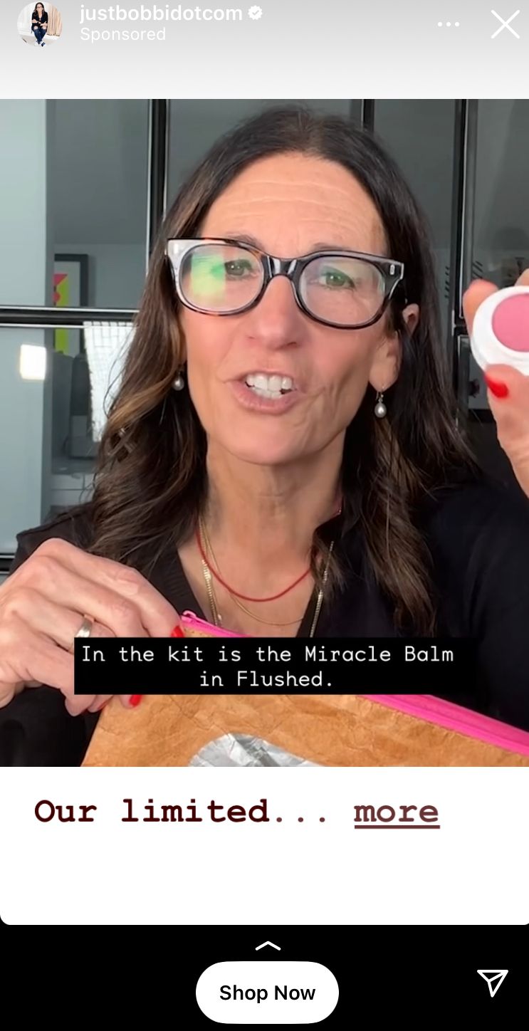
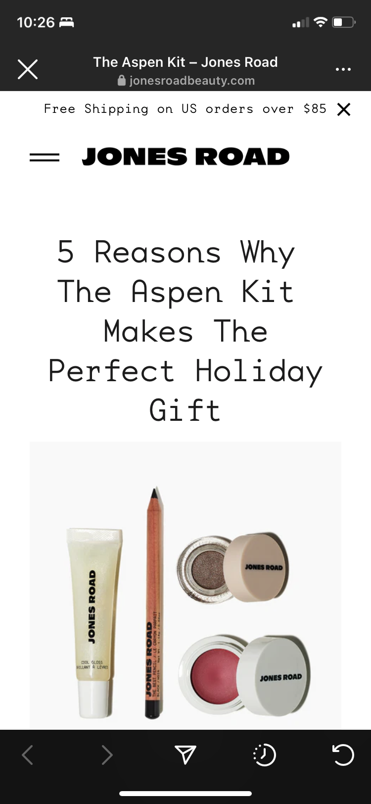
Example: The Jones Road ad shows what's in the holiday kit. The landing page further expands on products in the kit, with more clarity on each product and why you should get it for yourself, or as a holiday gift, now.
5. creates a clear path to the conversion goal
Example: After all the hard work on persuasion, make sure the conversion goal CTA is easily accessible. With AG, the Get your AG1 button floats on the top right corner, clicking it leads users to the pricing options, a clear path to the conversion goal.
What content to put on a landing page
The answer is always it depends. It depends on:
- Target audience, who are you communicating with?
- problem aware: why they need a solution to their problem.
- solution aware: you don't need to talk about why they need a solution, but you need to talk about why they need your solution.
- product aware: for the mid-funnel audience, nurture them with more detailed product information to assist evaluation.
- most aware: for the bottom-funnel audience, content to assist conversion.
2. Goal: the bigger the ask (conversion>lead) the more information needed.
3. Source: do users mostly come from Instagram, where they probably are not in the state of mind for long-form content or purchase on mobile? If so, they probably prefer a gamified quiz to dense text, you collect their email to further nurture them, and let them go back to scrolling. Test and figure out what content best serves users from each source to reach your goal.