
When I was learning D3, although there are a lot of great resources to learn from, I can rarely find detailed code explanations for me to fully understand how everything works, making it difficult to recreate a chart on my own without additional searches. So I want to fill this whitespace with a series of D3 (v4) line-by-line code explanations for each chart I create, sharing with you what I’ve figured out.
In this post, I am going to take you through how to build a multiple lines chart with D3, with axis, legend, source, and title added in as well.
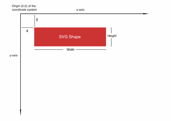
Set Up the Canvas
To set up the canvas for D3 graphs, in your HTML file :
- Line 4: Load D3 directly from d3js.org — so you don’t need to install locally.
- Line 5: Load colorbrewer — we are going to use a color palette from this package.
- Line 8–30: Style section to style different elements.
- Line 34:
onload= “lineChart()”means we are telling the system to load thelinechart()function immediately to show D3 graphs after the page has been loaded. - Line 36–37: Create a
SVGin the size of 1200px by 750px for us to put graphic elements in later. Load the grid image from the URL to set it as the background image for the SVG canvas.
Scale values for x-axis and y-axis
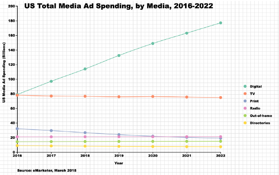
Now we move on to create the D3 linechart() function. In this example, our data is the seven-year ad spending data for each of the six main media channels pulled from eMarketer.com.
Line 4–47: Input data.
Line 50–51: Set the left and top margin. Because we will draw our x-axis and y-axis from the left and from the top, we want to leave some space on each side so the labels will be completely shown.
Line 54–58: We need to tell D3 that the values in the year column are years, not integers, so we scale them correctly when drawing the x-axis. d3.timeParse(“%Y”) convert the input data in the year format (%Y) to a format that D3 recognizes as years. Then we use the foreach{} function to pass each element in the year array to the function.
Line 61–62: When drawing an axis, we need to scale the value range so it will draw correctly scale-wise on the canvas.d3.extentreturns the range of the year. Then we use d3.scaleTime() to scale the time, pass the range to .domain() and then scale it to the range we will draw the axis on [leftMargin, 900] .
Line 65–66: We will do a similar scaling for the y-axis. But instead of using d3.extent, we find the maximum of the value using d3.maxand add the top margin to make sure we are leaving enough space on top of the y-axis. Notice that for the y-axis, the range is [600,0], because the y-axis is drawn from bottom (600) to top (0).
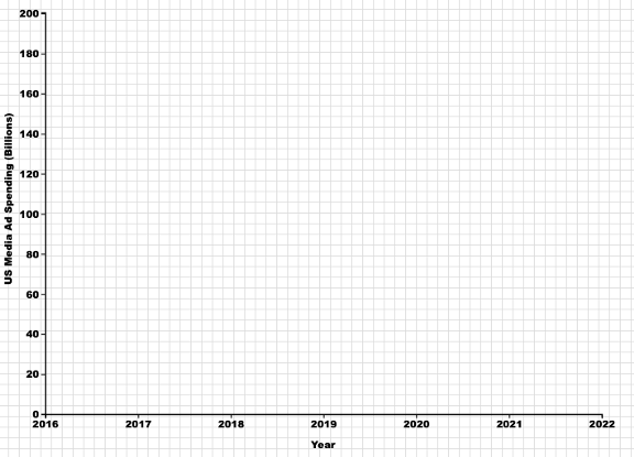
Draw x-axis and y-axis with D3
Line 2–3: Set up the xAxis function we will call later. d3.axisBottom() is a function that will create a horizontal axis, ticks will be drawn from the axis towards the bottom, labels will be below the axis as well.
Line 5–9: Draw the x-axis. It will be drawn from the origin (0,0) top-left corner, so we need to move it down using translate(0,620)
Line 10–13: Append x-axis label, and position it to be at the middle-center below the x-axis —. attr(“x”,(900+70)/2) and .attr(“y”, “50”)
Line 16–18: Set up the yAxis function we will call later. d3.axisLeft() is a function that will create a vertical axis, ticks will be drawn from the axis towards the left, labels will be on the left side of the axis as well. Ticks(10) specifies the number of ticks we want to show.
Line 20–24: Draw the y-axis. We move it a little bit to the right so we will have the left margin left for labels, and a little bit down so it will intersect the x-axis using .attr(“transform”,`translate(${leftMargin},20)`) .
Line 25–30: Append the y-axis label. By default, the text is drawn from left to right, so we need to rotate it anti-clockwise by 90 degrees.attr(“transform”, “rotate(-90)”). "text-anchor” is used to tell d3 that the (x,y) position of the text should be based on “start”, “middle” or the “end” of the text.
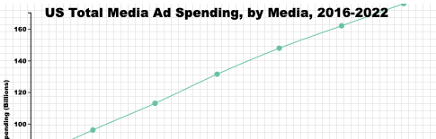
Your output so far should look like below.
Draw multiple lines with D3
Line 2–4: In order to draw multiple lines with each line representing one media, we need to group the data by media using the .nest() function. .key(d=>d.media) tells d3 to group the data by media column.
Line 6: Always a good idea to use console.log() to print out the data object so you can get a concrete idea of what it looks like.
Line 9–10: We use .map() function to return the array of keys ( media channels) in the nested data. Then we usescaleOrdinal(), a function to scale ordinal data, to match each color in colorbrewer.Set2 to each media channel.
Line 17: Use the nested data .data(sumstat) so a line will be drawn for each group.
Line 19–25: Draw the lines by appending “path”. The attr(“d”) defines the path to be drawn, within it, we call the d3.line() function that will create the d attribute of the path following the sequence of points we will define. Set x-coordinate to be the year, y-coordinate to be spending, for the curve, we use the curveCardinal type d3.curveCardinal.
Line 27: For the color of each line, we call the color() function we created before to give each group its assigned color.
Line 32–41: We will draw a circle for each data point to highlight that those are the discrete data points we have vs. continuous data throughout the years. To do this, we will use data instead of the nested data sumstat, because we are not drawing one circle for each group. .attr(“r”) defines the size of the circle, .attr(“cx”) defines the x-coordinate of the center of the circle, .attr(“cy”) defines the y-coordinate of the center of the circle. Finally, we use the color() function to give each circle color based on its media.
Your output so far should look like below.
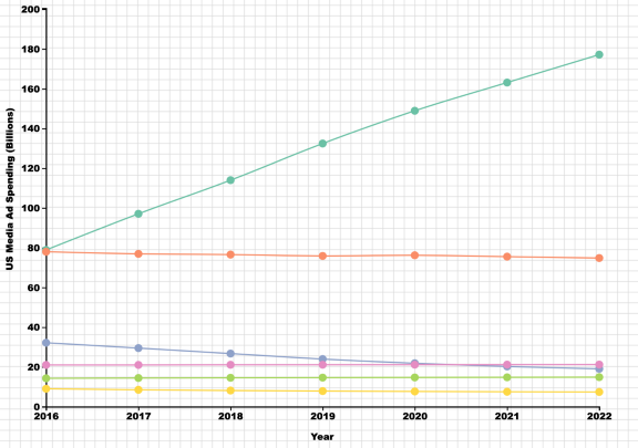
Append legend, source, and title with D3
The final touches of this chart are its legend, source, and title. We will cover annotation and tooltips in our next tutorial. These are important but often-neglected elements of an effective chart (more on this here).
Line 2–7: Set everything up for drawing a legend by appending g to group all the elements, entering the nested data sumstat so we draw one circle for each group, assigning class .attr(“class”, “legend”) for styling.
Line 9–13: We first draw the circles of the legend. We want to position them in one column, this means each circle will have the same x-coordinate .attr(“cx”,1000) and the y-coordinate increases by 30px from one to the next .attr("cy",(d,i)=>i*30+355), i indicates the position number in the array. Again color will be assigned using the color() function we created before.
Line 15–18: We create the text labels in a similar way to the circles, set the x coordinate a bit right to the circles .attr(“cx”,1020)
Line 21–39: Finally, we add in the titles and source. For a single chart, it’s very easy to do. We just append text to the position we want. The code should be pretty self-explanatory. I recommend you using live-server so you can instantly see the position of the text as you change your code.
Your final output should look like below.

This helped? More tutorials here👇