

"You cannot manage what you cannot measure."— Peter F. Drucker
Analysts spend a good chunk of time building dashboards. The goal is to make basic insights discovery as self-serving and as automated as possible to avoid too many ad-hoc analysis. However, while the impact of other parts of the job (e.g. experimentation, modeling, strategic recommendations, etc.) can be easily shown afterward; the success of dashboards is often harder to measure. There are just so many questions to ask when considering if a dashboard works or not, so often people don’t ask them at all.
But the danger of no measurement is even greater. You cannot improve if you don’t know what you did right or wrong. And you cannot prove the value of your work if you cannot measure success — those who make a conscious choice to do so will get promoted over those who don’t.
In this post, I will share some of the things that have worked for me to measure the success of dashboards, as well as what I’ve done to collect feedback to improve. Some are based on learnings from the book Visualization Analysis & Design* by Tamara Munzner.
*The book offers many valuable lessons but the writing is very “ academic” with lots of jargon. I still recommend it, just don’t expect an easy read.
Define Success
You should always define what is success before you build the dashboard. If you don’t know what success is, then there’s nothing to work towards and measure against. Surprisingly, many people skip this step in whatever they do.
I usually define dashboard success as stakeholders use them regularly to find answers to questions efficiently and to assist their decision-making effectively. That’s a lot of things packed into one sentence, let’s break it down:
- Dashboards are used regularly: Stakeholders should know the dashboards exist, can find them easily, and use them regularly. How regular depends on the stakeholder and the dashboard, CMO checks some of the dashboards only monthly/quarterly, and campaign managers need to monitor ads performance at least once a week.
- Find answers to their questions efficiently: dashboards are built to serve a need. They need to be able to answer questions of whom they are built for. And the latency of interaction and navigation should be short enough to have the questions answered in a reasonable amount of time.
- Assist decision making effectively: the interpretation and presentation of data should not be misleading to lead to any wrong decision making. A 50% increase without the denominator indicated can easily lead to a wrong impression and wrong decision.
How to measure success and what to do about them?
As difficult as it is, there are a couple of things you can monitor to measure success and collect feedback about your dashboards.
Usage Rate
Usage rate is the best indicator of the quality of a dashboard. If a dashboard is used by stakeholders regularly, it’s already reached a level of success. One wouldn’t use something that is not useful.
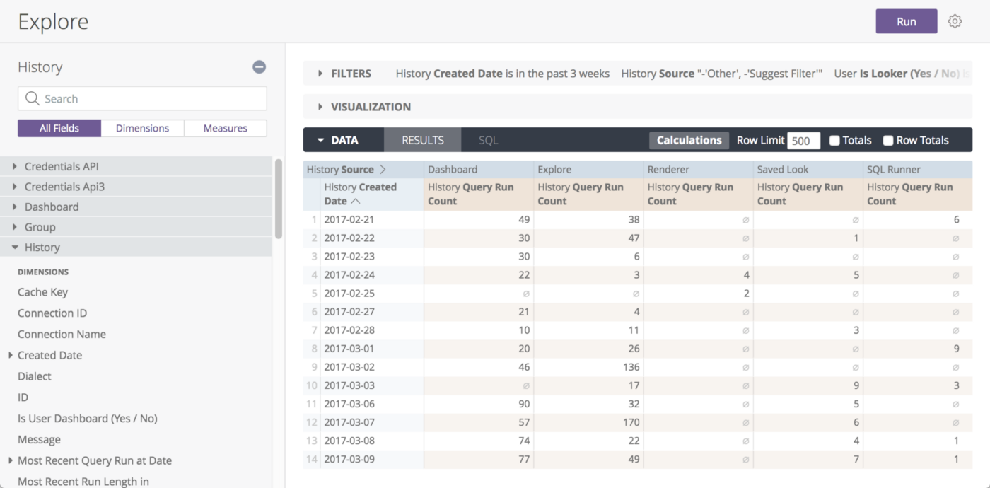
If you use Tableau or Looker, you can easily see in the backend users and frequency of them accessing the dashboard. If you don’t have those metrics available, try to bitly the links and monitor the number of clicks.
If the usage rate is low, it could mean your dashboard doesn’t help your stakeholders and you need to speak to them about the misalignment. But in my experience, more often than not, they just don’t know the dashboards exist or cannot find them! My trick is to have the right dashboards auto-delivered to their inbox at the right time.
Anecdotes of insights found, hypotheses confirmed, and great decisions made
The second level of success after stakeholders start using the dashboards is when they leverage them for insights and decision making. These feedback usually comes in the form of anecdotes that you can also proactively seek out by asking around. Even better, you know your dashboards are good if you see screenshots of them in presentations, email threads, or slack conversations.
Peer Review
Peer review is an invaluable way to get feedback, especially on your visual designs. Other analysts can spot issues that your stakeholders, who are not experts in the field, cannot easily detect. For example, using a partial y-axis scale to distort perception (per below).
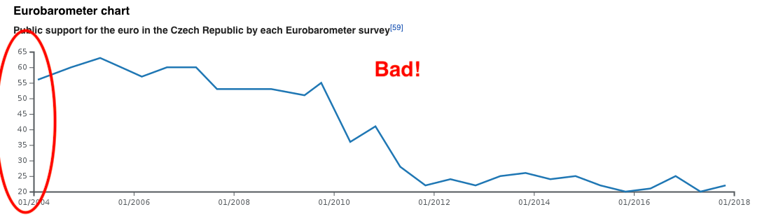
Getting a peer review before sending it to stakeholders is a sure way to remove any misleading visual design landmines that could lead to wrong decisions made based on them.
Response Time
A dashboard that takes too long to load or to interact with is deemed to be unsuccessful, as it will constantly interrupt the user’s flow of thought and fail to keep the user’s attention, making insights discovery, which almost always requires filter/select actions, impossible. According to Miller’s research on “Response time in man-computer conversational transactions”, 1 second is about the limit for the user’s flow of thought to stay uninterrupted, 10 seconds is about the limit for keeping the user’s attention focused on the dialogue.
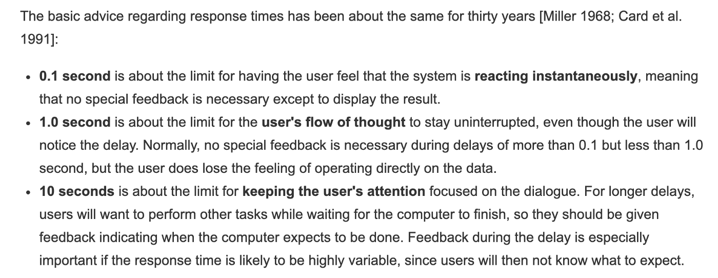
Munzner advises that “if an action could take significantly longer than a user would naturally expect, some kind of progress indicator should be shown to the user.” (Visualization Analysis & Design).
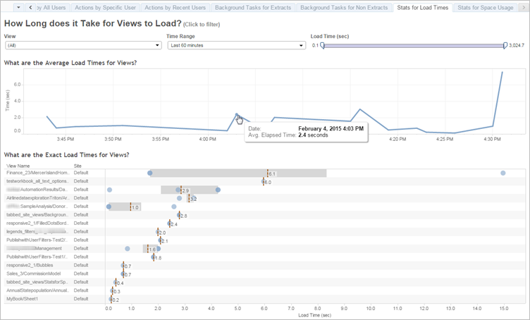
A simple test would be to interact with the dashboard yourself and see if your flow is interrupted by any response latency. Tableau also offers detailed metrics on load time for each interaction.
Common ways to reduce response time is to reduce input dataset size through change data type (string to number) or add master filters. Alternatively, you can reduce the number of charts or filter options on the dashboard.
All of that being said, you should also remember that visualization is not a simple linear optimization but a series of tradeoffs. A design that does well in one aspect might do poorly in another, such as the tradeoff between interactivity and response time.
I hope by using usage rate, anecdotes, peer review, and response time as proxies of success, visual designers can at least have something to measure against and know what to improve. You cannot improve what you cannot measure.
Mentioned in this post:
- Visualization Analysis & Design by Tamara Munzner