
When I was learning D3, although there are a lot of great resources to learn from, I can rarely find detailed code explanations for me to fully understand how everything works, making it difficult to recreate a chart on my own without additional searches. So I want to fill this whitespace with a series of D3 (v4) line-by-line code explanations for each chart I create, sharing with you what I’ve figured out.
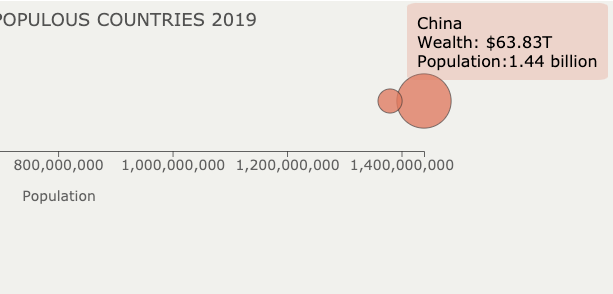
As promised in the previous post, I am going to show you how to create hover-over tooltips in D3 by creating this bubble chart together.
Set Up the Canvas
To set up the canvas for D3 graphs, in your HTML file :
- Line 4: Load D3 directly from d3js.org — so you don’t need to install locally.
- Line 7–51: Style section to style different elements.
- Line 56:
onload= “hoverOver()”means we are telling the system to load thehoverOver()function immediately to show D3 graphs after the page has been loaded. - Line 58–59: Create a
SVGin the size of 1000px by 300px for us to put graphic elements in later.
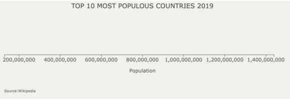
Draw Axis, Title, and Source with D3
Now we move on to creating the hoverOver() function, which we will put into the <script></script> section after the body section. It’s recommended to create the D3 script in a separate file. But for the ease of sharing, I will put it together with the rest of the HTML.
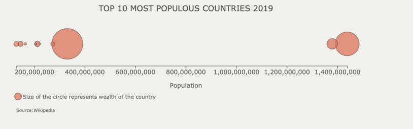
The data shows the wealth and population of the top 10 most populous countries in 2019, pulled from Wikipedia. The purpose is to show the relationship between the two variables.
Line 2–13: Input data.
Line 16: To draw the x-axis, we use d3.scaleLinear() to scale the range* of the population to the range of the positions you want to draw the x-axis, in this case, from 50px to 800px.
- You can use
d3.extent()to get the range — I got lazy and copy and paste the range here.
Line 18–20: Set up the xAxis function we will call later. d3.axisBottom() is a function that will create a horizontal axis, ticks will be drawn from the axis towards the bottom, labels will be below the axis as well.
Line 22–26: Draw the x-axis. It will be drawn from the origin (0,0), the top-left corner, so we need to move it down using translate(0,150)
Line 27–30: Append x-axis label, and position it to be at the middle-center below the x-axis — . attr(“x”,435) and .attr(“y”, “20”). "text-anchor” is used to tell d3 that the (x,y) position of the text should be based on “start”, “middle” or the “end” of the text.
Line 33–47: In a similar way, append the title and the source, position them to the position you want.
Bubble Chart and Tooltips with D3
When drawing circles representing numeric values, you should use the area (right) to represent values instead of the radius (left), which is misleading visually.
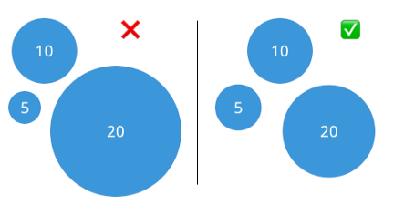
This means we need to transform the value we want to show through the bubbles to its respective radius instead input them as radius directly.
Line 1: Set an upper boundary for the circle you will draw. Math.pow(25,2) returns 25 to the power of 2.
Line 3–5: Scale the range of the variable .domain([0,106]) to the range of the area of the circle .range([0,maxCircleArea])
Line 8–10: Then transform the scaled area into the radius of each circle. We will use the output from this function to draw each circle.
Line 13–16: Prepare to create the tooltip by appending it to the body instead of SVG. Set position as absolute so it can overlap with other elements. Set opacity as 0 so it doesn’t show as default.
Line 18–25: Draw the bubble using the scaleCricleArea() function to transform the values of the wealth column into radius.
Line 26–30: On mouseover, we will select the tooltip id we created, and show the tooltip section by setting opacity to 1. .transition().duration(200) adds a delay so the tooltip gradually shows up.
Line 32–34:Select the tooltip again, set the text we want to show using html(). And set it to show up where the hover over happens using d3.event.pageX and a little bit up by 10px.
Line 36–38: When mouse moves out of the circle, set the opacity to 0 again to hide the tooltips.
Line 41-52: Finally, set the legend to explain what the bubble represents.
Your final output should like below.